
How to Decorate a Room from Start to Finish in 13 Steps
13 proven steps broken down to explain how to decorate a room from scratch + budgeting tips, styling advice, and ways to personalize your home.
Whether it’s a huge job like a kitchen renovation or a small job like a quick bedroom refresh, understanding the methodical process about how to decorate a room can make all the difference in the world.

The thought of a brand new space is exciting! But then it can start to feel overwhelming.
Over the years, I’ve nailed down a design planning process that I swear by, and it has guided me through so many of our room makeovers that I’ve completely lost track at this point.
A lot of times, people try to do everything at once. They immediately start choosing paint colors, picking out curtains, buying art and then end up confused about how to put it all together cohesively.

The truth is the most important part about decorating a room happens before buying that first gallon of paint. You can’t put a roof on a house until it has a foundation. You can’t build a foundation until you have a blueprint. If you don’t know how to decorate a room, the order of events are so important.
This 13 step process I’ve used for years will give you the blueprint you need to build a beautifully decorated room exactly the way you want it from start to finish every time.
How to Decorate a Room in 13 Steps

1. Find Your Style
You’re probably sitting there like, “Duh, Lauren.” But it’s worth mentioning!
Before I figured out what was really “us” in our home, I felt completely lost about how to decorate our empty rooms. There were too many great ideas out there and a million possible different directions. There was a big process involved to sort through my identity crisis, but once I figured out “our style”, everything fell into place.
How to Find Your Style
Use your wardrobe for inspiration
Take a look at your wardrobe and think about your favorite outfits. Why do you wear them?
Do you wear a lot of prints (what type) or do you like mostly solids? Do you like getting dressed up or do you usually prefer casual? What colors are represented the most in your closet?
One of my favorite outfit combinations is jeans with a blazer and ankle boots. It’s classic, dressy casual, sometimes layered with a subtle print top, and because my closet is mostly full of neutrals, blues, and greens, it’s reflected in our interiors as well. It’s my comfort zone both in my clothes and in our rooms.

Look for commonalities in saved photos
Browse through Instagram, Pinterest, and blogs to save any interior design ideas that inspire you. Once you have collected a lot of images, look back through them and see what elements they have in common. Sometimes we only save a room idea because of 1 or 2 details that grab our attention.
By reviewing a large album of those photos we save and looking for commonalities, we can better pinpoint what our subconscious loves even if we can’t put it into words. Do the photos have similar furniture shapes? Do they share a similar color palette? Are the wall moldings conducive to a certain style?
Write those similarities down. Those details make up your personal style, even if you only knew it subconsciously before.

Ask yourself what mood you want your home to have
Describe how you want your home to feel in 2-3 words. Our environment affects how we feel, so it’s a really important question to ask yourself.
Here are some words to help you decide your room feel. Pick 2 or 3 of them. Then, as you decorate, ask yourself if each element fits in line with your chosen moods.
| Cheerful | Serene | Fresh | Bold |
| Bright | Edgy | Innovative | Trendy |
| Inviting | Crisp | Inviting | Collected |
| Minimal | Fun | Sophisticated | Clean |
| Casual | Friendly | Vibrant | Timeless |
| Formal | High-End | Neutral | Airy |
2. Decide on Your Room’s Functional Needs
Ask yourself what your room is currently lacking that would make it function better for your family.
- What storage solutions do you need?
- How do you and your family use that space day-to-day?
- What changes to the room would make your routine easier?
- If you have limited space, what are some pieces of furniture that could serve a dual purpose?
Sometimes you need a dining room that can double as a home office, so planning to incorporate a buffet cabinet as storage to hide away books and a laptop helps.
With young kids, having a coffee table in a living room that doubles as toy storage is a game changer.
If you need a desk in your bedroom for work but also a space to put on makeup, let the desk double as your makeup vanity.
Whatever the case, write down your answers so that those pieces become the top priority in your room’s design.

3. Keep in Mind Who Will Use the Space
- Are there children present?
- Do pets frequent this room?
- Is this room only for you or your spouse?
I know all of it goes without saying, but I won’t even attempt to incorporate a sofa or chair without easy-to-clean upholstery since we have 2 kids and a dog running around constantly testing them. Glass tables are a no-go for our current phase of life in a living room.
But in my bedroom, since kids don’t usually frequent there, a reading chair with less durable fabric is totally okay.
As much as I love the look of a chandelier above a bed, I know my hot-natured husband will not be on board for anything but a ceiling fan. So I can plan for that ahead of time.
You know your family’s likes and dislikes and what they can handle better than anyone. After “Functional Needs”, write those smaller details next in your plan.

4. Make a Wish List
This step is especially important if you’re designing a larger renovation like a kitchen or bathroom. Have a brainstorming session to jot down every single thing you can think of that you want in the space and use that as your jumping off point to decide how much you’ll need to spend.
Once you have written down every element you can think of that you want, prioritize your list from most-important to least-important. Have your spouse make a prioritized list too. (This helps later if you need to remove some of your “wants” to stay under budget.)
Talk it over with your spouse to decide what projects need to be done or what needs to be bought for everyone to be happy. (Having that conversation with your spouse is so helpful before starting a renovation so you are both “on the same page” and in continuous communication through the project.

5. Measure the Room and Decide Your Layout
Write down every single measurement in your floor plan that you can:
- Room dimensions
- Window dimensions
- Wall widths between doorways
- Any architectural details that could impact traffic flow or furniture placement
Start planning where you want to place furniture in the room. Consider traffic flow through doorways, directional door swings, or outlet placement for lamps or electronics.
Tip: You can even place painter’s tape on the floor to mimic the size of a piece of furniture and get a better visual. (Just make sure your floor isn’t susceptible to damage using that method.)
If you want to get extra technical, Plan Your Room is a great free online tool for “trying on” layouts in your room virtually.

6. Create an Inspiration Board for the Room
Make a Pinterest board or Instagram save collection specifically for the room you are decorating. Use it to visualize how all of your inspirations work together, and let it serve you to more easily communicate your vision to your spouse and/or contractors.
7. Hash Out a Budget
Get real with the numbers. Decide what elements are worth the splurge and which items you can save on. (Even better, what items can you make yourself or thrift?)
Don’t forget to include project supplies like paint brushes, drop cloths, nails, and the little things that add up.
I like to keep a spreadsheet along with all of the links to items I plan to use, so I have all of my resources and links to items I need to order in one place.
Try to leave about 20% in the budget to help with unexpected expenses or projects that go awry. (Not that any project has ever gone wrong around here. Ha! Wink wink.)

8. Think About the Rest of Your House
Before jumping into choosing colors or deciding on a final look for your room, consider how the rest of your house looks (assuming you’re not planning on redecorating those rooms in the near future too).
Try to keep a general flow going from one room to the next (knowing your style makes this easy to do after a while).
Rooms don’t have to match, but it’s helpful to remain within a related color palette and similar decorating styles to keep your home cohesive.

9. Start with Art, Wallpaper, or a Textile to Begin a Decorating Plan
It’s easier to start planning a room with one of those three items before anything else. That’s because it’s much easier to match a paint color to a fabric pattern (like an area rug), wallpaper, or art than the other way around. (See more tips for choosing the best paint color for your room’s lighting here.)
Use that one item as your main inspiration piece.
After the fabric and paint colors, decide on coordinating fabrics, wood tones, and metal finishes to determine your furniture and fixtures, always keeping in mind your 3 mood words you chose for defining “your style”.
For instance, unlacquered brass creates a feeling of warmth, formality, and timelessness. Bleached wood is associated with minimal, airy, casual spaces.
Look at all of your colors, patterns, and textures all together to see if all of the elements complement each other and align with your style, then adjust as you need.

10. How to Decorate Using a Mood Board
This is the fun part!
Creating a mood board is so helpful because you can “try on” decor in a room before buying anything. Sometimes I can’t really decide if I’m happy with the room inside of my head unless I spill it all out into a mood board.
If you can see the room pulled together on a mood board and end up not liking it, you won’t have to pay the price of a bad decision later.
I typically use Canva to make a room design mood board, but you can also use something as simple as PowerPoint or Google Pages. Here’s a quick tutorial to show you how to decorate a room using a mood board.

11. Place Large Furniture Pieces First
Since its the sofa and armchairs that will anchor the living room or the dining table and dining chairs that will anchor the dining room, start with choosing those items before the rest of the decor.
After Step 9, these larger pieces should work into your plan next. Double check dimensions to make sure everything will fit within your layout plan, and keep asking yourself throughout the furniture selection process if the items stay true to your style.

12. Go Shopping for Accents (But Keep Swatches Handy)
Accents can be the best part because it’s the little details that can really let your personality shine. Keep those 3 mood words in your mind as you choose lamps, accent tables, pillows, and accessories. (Don’t forget to shop your house to see if you can use your older decor in new ways.)
When I visit thrift stores or antique shops, I like to keep paint and fabric swatches in my purse along with room measurements in my phone’s notepad. That way if I find that “perfect” something, it takes out the guess work so I’ll know it works in the room right on the spot.
How to Decorate a Room With Accents
- Coffee Table Decor Essentials and How to Style Them
- End Table Decorating Tips
- How to Decorate a Buffet & Style Anything
- 4 Simple Nightstand Decor Ideas
- How to Decorate Shelves
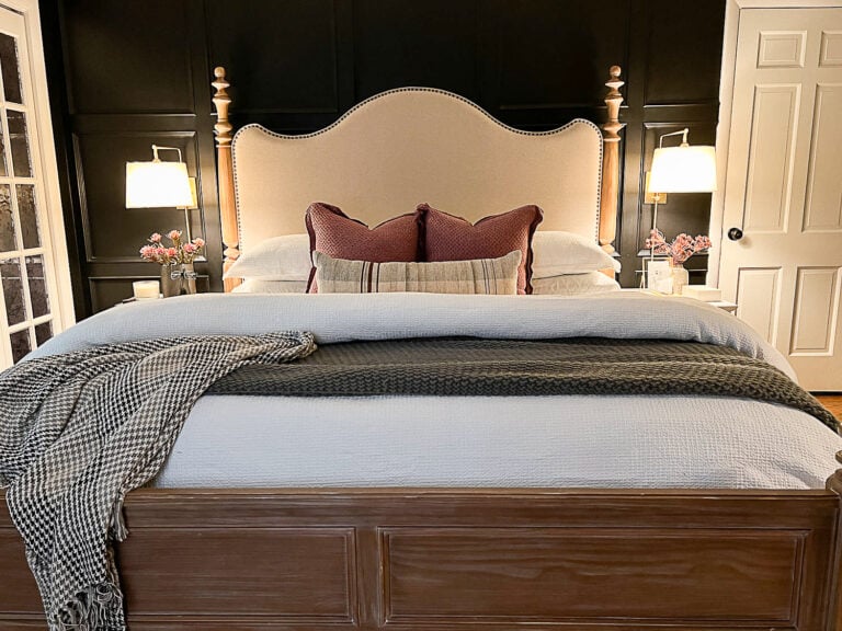
- 7 Tricks for How to Make a Bed Fluffy
- How to Decorate Kitchen Countertops

13. How to Decorate With Personal Touches That Tell Your Story
No room is complete without pieces that have sentimental value to you and your family. Try incorporating a gallery wall of sentimental photos or art signifying a piece of family history or a favorite interest. We use mementos from family vacations or items from our relatives’ past as decorative accents on shelves or tabletops.
Those pieces are what make a house a reflection of your family, and I mean, they’re free so why not? And they’re pretty fab conversation starters when guests come to visit.
A room that looks magazine-worthy is pretty and all, but nothing can beat a room that is decorated from the heart.

That’s my brain on home decorating “planning mode”. It’s a lot, but it’s become second nature for me at this point.
Robert and I usually share our ideas with each other about a room, spend some time measuring and searching for resources, and we bust out the power tools and paint brushes to make it happen.
Do you have any designing and planning methods that you use to help your rooms come together in your own home? Or are you more of a “wing it” and it still turns out beautiful kind of person?
However you do it, make it a reflection of you and your family and own it, baby.

Frequently Asked Questions
Start with the room where you and your family spend the most time and work your way down to the least used rooms. The benefit of finishing one room before moving onto the next is you can feel less overwhelmed, you can enjoy a fully completed space while the others are construction zones, and you can see your design vision completely through without distractions.
1. Rearrange your furniture to try a new layout.
2. Shop your house to use decor in a different room.
3. Check classified listings and thrift stores for secondhand furniture.
4. A gallon or two of paint can completely transform an entire room for around $100.
5. Declutter and reorganize. (That alone can make a massive difference.)
6. Spray paint your light fixtures or swap your lamp shades for a new lighting look for less.
7. Refresh just a few textile pieces – throw pillows in the living room, a comforter in the bedroom, or the shower curtain in the bathroom.
8. Swap your rugs from room to room.
9. Add a few plants.
10. Do a furniture/decor swap with your friends! Put post-it notes on items you’re willing to let go of and shop each others’ homes for a room refresh without spending a dime.
Related Posts
- How to Make a Mood Board Room Design on Canva
- 14 Big Impact Ways to Redecorate a Room Inexpensively
- 40 Ways to Improve Your Home for Under $100
- How to Transition to a New Decorating Style


Hi Lauren! I love your blog and this post was great. Do you think maybe you could do a post some time on creating a mood board? I know you said you use polyvore, but would love to see how you do it.
Hi, Heather! There’s actually a tutorial about it in my decorating e-course. If you’re already a subscriber, the link is at the bottom of all of my emails. Hope that helps!
Great tips! I’m embarking on the One Room Challenge tomorrow and decided to walk everyone through my process a little more than just showing the projects (although that’s fun too). All of this is great advice.
I also agree with Kathy on looking at the style of your home to dictate improvements. I have a builder basic I’m trying to infuse some character in. The shell of it is a craftsman but it was totally devoid of any character. I made the mistake of putting traditional crown molding in our master bedroom at the beginning. In the rest of our house I have been adding more traditional craftsman woodwork with simple straight cuts and stacked wood and it is so much better.
I can’t wait to see your makeover!
Nancy
Best of luck with it, Nancy! We’re not doing the ORC this year, for obvious reasons, but there’s a whole lot that’s about to happen soon. I know what you mean about the molding. We chose traditional molding when building our last house and then I immediately wished we’d gone with Craftsman style instead. It’s so much easier to DIY, and I love the more casual character of it.
I would like to add, adapt to the style of your house.
Now that may sound counter to what most people advise, but if you do have a definate style, then be sure to buy a house that will work with that style. Sure some talented designers can make combined styles work, but most people can’t, or it takes a lot of money and in the process you could be destroying what makes that house special. If you like beachy, leave the Craftsmans with all original woodwork for someone else. If you like modern, don’t buy a high style Queen Anne. If you like traditional and Colonial, don’t buy a 70’s contemporary. People buy houses for all kinds of reasons, including price and location, but if you don’t like the bones of a house, pass it up.
I used to post a lot on Houzz (it is quite addictive) to advise people about the style of the house and where to find products and information about that style, and what could be done to freshen it up a bit. Saw lots of questions on how to make their house something it can’t be, and doing things like painting 1920s wire-cut brick, or tiling over 1950s roman-style brick, removing 1930s leaded glass windows or painting old brick exteriors, which dooms all future owners to a lifetime of maintenance and moisture issues. So many people don’t have a clue about historic style and perform all kinds of modern remuddling in the name of updating their house. I particularly shudder when they tear out old-growth wood, original doors, original fireplaces, mud-set tile floors, real wood floors, cast-iron bathtubs and original windows. Most of that stuff is nearly irreplacable, and the modern stuff may look nice at first, but doesn’t compare in longevity or quality.
All these home shows showing people smashing up walls and vintage bathrooms don’t help. Once you start doing that, the price tag skyrockets. The awful aluminum siding and old wallpaper of years past is nothing compared to what is done to houses these days. At least those mistakes are somewhat reversable.
If you have a fairly new, builder basic box, that it a fairly blank slate and there is more wiggle room for transformation, but old houses have a history and a style. It can take a lot of work and research for some remuddled diamonds in the rough to figure out what is going to work. Learn about the original style and the style of the renovations of the past and pick the best. Learn historic details, proportions and colors and gently modify to make it work for you. You don’t have to live in a museum, but without knowing what makes each house special, you are in danger of inadvertently destroying its character to follow a trend.
First of all welcome to Texas. I was born and grew up in GA, but now Austin is my home. It is a beautiful, fun place to live. We love it out here. The weather is beautiful and you are going to enjoy the Bluebonnets and other Texas wild flowers.
I have been following your blog for a few months. What an inspiration. I will be following along to see what you will be doing with Lowe’s.
Thank you, Judy! We just returned on Sunday and the weather was absolutely gorgeous! Already can’t wait to go back for a laid-back visit one of these days.
Have a wonderful time in Texas!! I hope the weather is great for room makeover-ing! We will be following on IG 🙂
The weather was perfect! Couldn’t have asked for anything better. 🙂