
Aqua Meets Urban Powder Room Reveal
A dated powder room gets a modern meets traditional, urban meets farmhouse makeover with black and white floral wallpaper.
Some of the best rooms are the ones that check off multiple boxes. You know what I mean?
Several years ago, before I ever painted a piece of furniture or set out to decorate a space with an actual plan, I always thought you had to stick to one style. This room is industrial, this room is rustic cabin, this room is glam. Chop, chop, chop, check-a-box-and-stay-inside-of-it.
But I realized I liked too many styles and how in the world was I going to pick just one to decorate our entire home? I’m not a school-trained designer. I just know what I like. And then I said, “Whatever. This is my house. Who’s going to stop me from throwing in everything?”
And do you know what happened? I started to love our house. It became home. Because I stopped caring about what was acceptable and just let everything in the world inspire me. (Staying in one lane gets boring, ya know?)
This time, it was Chicago that captured our powder room’s heart. Earlier this summer, I mentioned how I’d ventured to Chicago with Delta Faucet, Young House Love, and SheShe for A Day of Inspired Design to study how water and architecture could influence design in our own homes.
That trip taught me even more about finding inspiration everywhere and, again, creating a space that doesn’t check just one box.
It’s a little urban and a little country, a little modern and a little vintage, a little masculine and a little feminine. It’s timeless but also daring.
Every time I walk into this powder room, it takes me back to that trip, that moment of gazing at the Chicago skyline, with the black and gray steel skyscrapers, sprinkled with Art Deco brass and marble, towering above the fluid teal of serene Lake Michigan.
I never would have learned about myself and this little powder room’s potential if I didn’t let that one moment challenge me.
Before, our powder room was all beige and orange and just not our style.

So we painted the once-beige bead board in here Benjamin Moore Hollingsworth Green to match those calm waters of Lake Michigan and the green glass tiles in the Tiffany Dome.

The beige Tuscan-like travertine floors in this space were already nice, but they didn’t make sense with the rest of the room. So we ripped them out to replace with marble-look porcelain hexagon tiles for a nod to the city’s Art Deco style. (They were waaaay less expensive and easier to maintain than the real deal marble but with the same look.)

To add some dimension to the already existing mirror, I painted it Coal Black and dry-brushed it with a little white paint to give it the look of industrial steel, like the windows in the Chicago Cultural Center.

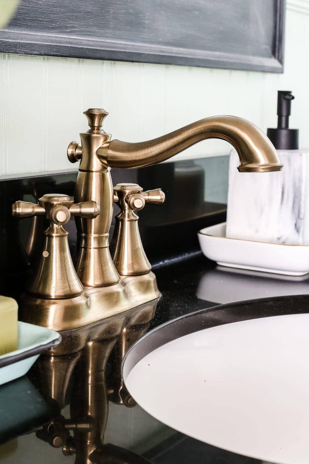
We captured the feel of the Art Deco aged brass of the city in all of the light fixtures in the space, and we chose this curvy Cassidy® in Champagne Bronze™ from Delta Faucet as a feminine detail. I love how it makes our sink feel luxurious but saves water with a WaterSense® Label®, since this is the most used bathroom sink in the house.

I always feel like the powder room is the wild card of the house and the one space where you can really be different and have fun with it. So we incorporated something we’ve never done before, wallpaper.
When I visited Chicago in May, there were spring flowers blooming all over the city. They looked more vibrant than I’d ever seen flowers, dancing in the breeze against the dull, gray backdrop of the metal skyscrapers and concrete sidewalks. I thought it would be interesting to combine the two in this black floral print and make it a modern twist on vintage wallpaper for a city-meets-nature feel.

To give the vanity more of a gray wood look, I just painted and waxed it and added black knobs.


To continue with the rest of the high-contrast scheme in our house, we painted the crown molding in Benjamin Moore Simply White and the door in Benjamin Moore Wrought Iron. That alone made a huge difference.

As for all of the accessories and wall decor, we kept it simple since we didn’t want this room to feel cluttered and chaotic. Just a simple vase of flowers went a long way.

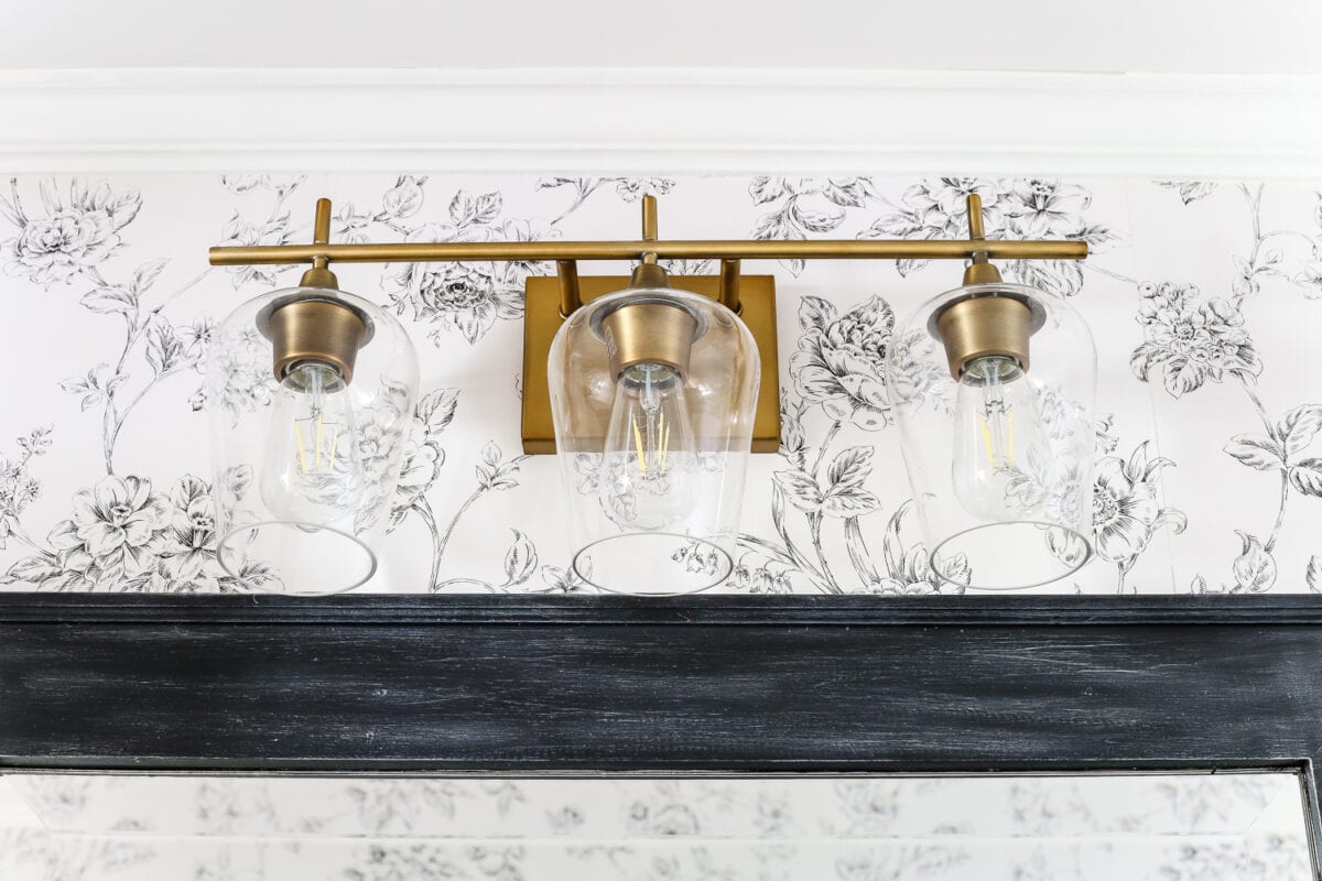
We added some warmth to the space, to contrast all of the cooler tones in here, and pulled in a little more of the brass in other accessories with this vanity light…
…this Cassidy® flush lever…

…and this Cassidy® towel ring.

For just a little touch of art, I framed some prints I found of urban flower markets for another nod to the city-meets-nature vibe. You can find this print by Sofica here.

So I guess that makes this our official fully completed room makeover in this house! (We still have a few lingering projects in the living room and master bedroom to really consider them finished.)
Here is the full breakdown of budget and sources:
- Bead board color- Benjamin Moore Hollingsworth Green $17.99
- Trim color – Benjamin Moore Simply White $17.99
- Door color- Benjamin Moore Wrought Iron $17.99
- Vanity paint- $34.95 (Vanity makeover tutorial here)
- Vanity black wax- $24.95
- Wallpaper– $29.22
- Wallpapering supplies- $31.98
- Black and white-brushed mirror makeover- $30.50
- Delta Faucet Cassidy Centerset Faucet in Champagne Bronze– $229
- Delta Faucet Cassidy Towel Ring in Champagne Bronze– $23.59
- Delta Faucet Cassidy Flush Lever in Champagne Bronze– $51.03
- Brass Vanity Light – $118.00
- Gold 11×14 frames – $14.99 each
- Hexagon Marble Look Porcelain Tile – $304.95 (total for 5 cases)
- Laticrete Sanded Grout– $34.99
- Hand towel– $6.99
- Marble soap dispenser– $6.99
- Apothecary jars– $19.99
- Woven wastebasket– $13.99
- Artificial flower arrangement and vase – $29.99 found at HomeGoods (similar linked)
- Enamel soap dish – $14.95
- Labor cost- $1,560.25 (If you haven’t been following along, we ran into a HUGE snafu that really threw us for a loop and put a big dent in our budget. Owning an old house is tons of fun like that. We’re so glad we called in the pros to handle our big issue though because we would not have survived.)
TOTAL: $2665.25

I never would have imagined this powder room looking like this when we first moved in, but I guess that’s what new perspective will do to you. I am so thankful to Delta Faucet for opening my eyes to all of the beauty that surrounds us every day. It makes me think maybe I need to venture down the street to uptown Charlotte to try it out for another room in our house.
Have you ever decorated your home because of what you’ve seen in your travels? Or ever thought brass would actually come back in style? Or that wallpaper would actually become a trend you’d try again? I don’t even know who I am anymore.
If you want to save this post for later, you can pin it here:


Sooo pretty! I love everything about it. Blessings.
Thanks, Betty!
Such a gorgeous makeover, Lauren! The flooring is a showstopper and the champagne bronze faucet is everything!
Thanks, Chelsea!! Loved your makeover too!
Loooove the makeover, Lauren! That hardware is awesome, and the flooring is SO good! ?
Thanks, April!!
Looks beautiful!!! I’m from Chicago and would never have thought to use it for inspiration or any city I visited. Love this idea, THANKS!!!
It’s a beautiful city! So much Art Deco awesomeness!
Looks beautiful!
Thanks, Michele!