
Best Navy Blue Paint Colors Recommended By Designers

Navy blue paint colors are the kings of classic. Just like that perfect pair of blue jeans that goes with every color, navy is just as versatile with all colors in all different styles of interior design. But finding the perfect navy blue can be tricky.
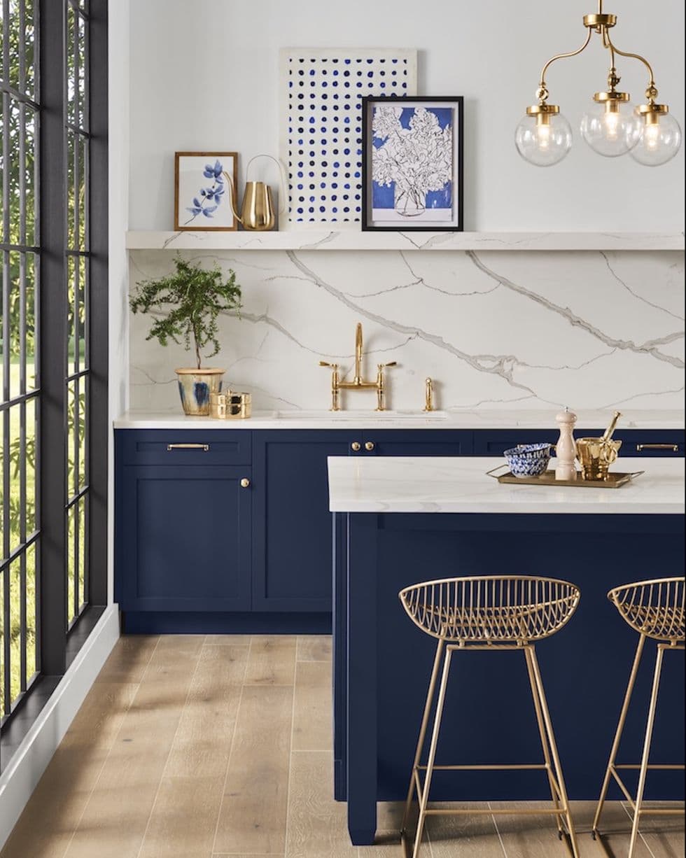
When in doubt in situations where you want a pop of color, dark blue paint is always a safe bet. Because it can still act like a neutral!
It is the perfect color when you want to embrace a darker color with a timeless look.

Where to Use Navy Blue Paint
Whether it’s a moody master bedroom, traditional home office, dramatic living room, an accent wall, or small spaces like bathrooms, a dark blue paint color is the perfect choice many interior designers make because it’s bold without stepping too far out of the comfort zone.
Ever since we painted our dining room navy, we have fallen in love. It is by far the most versatile color!
If you’re ready to embrace dark navy blue in your home, this list of the best navy paint colors widely used by interior designers will help with expert advice to use it anywhere.

The 8 Best Navy Blue Paint Colors
For our dining room wall color, we used Romabio Blue Ridge Parkway from the Bless’er House paint color line. It is an absolutely stunning dark blue paint.
If you’ve ever been baffled trying to find the perfect navy blue for your home (I especially love it on kitchen cabinets, islands, and furniture), consider this my shameless plug for Romabio Blue Ridge Parkway. BUT this list of other navy paint colors, widely recommended by designers, are real winners too.
After years of trying out swatches and using navy in our own home, this is our running list of favorites on the market today.

1. Benjamin Moore Hale Navy
Benjamin Moore Hale Navy is a classic and rich true navy blue paint color that boasts a balanced blend of sophistication and boldness, making it a favorite for accent walls and statement pieces or for an entire room.
It has a subtle mix of gray undertones, which softens the hue and provides a neutral base, making it versatile for pairing with a variety of decor styles and color schemes.

2. Benjamin Moore Blue Note
Benjamin Moore Blue Note is a deep, moody blue that can appear almost royal blue when paired with crisp whites.
Its undertones are a complex blend of black and navy, giving it a profound depth that works beautifully in both well-lit and dimly lit environments.

3. Benjamin Moore Polo Blue
Benjamin Moore Polo Blue is a rich, classic navy paint color that embodies an air of elegance and serenity in any space.
It has subtle green undertones, which add a unique warmth and complexity, making it a great choice for both classic and contemporary designs. It’s a popular choice as an exterior paint color for front doors and siding too.

4. Sherwin Williams Naval
Sherwin Williams Naval brings a sense of calmness and depth to any room.
As a brighter color blue, it has a slight, warm undertone of purple, which adds a layer of complexity to the color, making it versatile for a wide range of design aesthetics.
5. Benjamin Moore Newburyport Blue
Benjamin Moore Newburyport Blue is a vibrant, medium-toned blue, making it an excellent choice for creating a statement.
Its undertones are a subtle blend of gray, which softens the color and adds a layer of versatility, allowing it to harmonize beautifully with a wide range of decor styles and color palettes.

6. Behr Chimney
Behr Chimney is a deep, charcoal gray paint color that offers an elegant and moody ambiance to any space. Its undertones are a mix of blue, giving it a cool and slightly maritime feel, which enhances its versatility and depth.
This deep navy works as a perfect neutral leaning slightly more into gray than other options and is a great use-anywhere shade of navy.

7. Benjamin Moore Van Deusen Blue
Benjamin Moore Van Deusen Blue is a rich, smoky blue, perfect for creating a serene and sophisticated space.
Its undertones are subtly gray, which adds a soft, muted quality to the color, making it a favorite navy paint for many designers.

8. Farrow & Ball Hague Blue
Farrow and Ball Hague Blue is a rich navy with a historical depth, offering a luxurious backdrop to any room.
It is characterized by its subtle green undertones, which infuse the color with a unique warmth and complexity, enhancing its versatility in a variety of lighting conditions and design aesthetics.

What paint color sheen should I use?
Generally these are the typical recommendations for paint sheens (though rules can often be broken).
- Ceilings – flat
- Walls – eggshell (since eggshell can be wiped clean but isn’t shiny)
- Cabinets – satin is most recommended, but semi-gloss can be used if you prefer that extra shine
- Trim/doors – We typically use semigloss for a more traditional look, but satin works well for a more modern look.

How do I find which paint color is right for my space?
Sample, sample, sample.
- Narrow down your favorite colors to a select few from color swatch cards.
- Have color sample paints mixed at your local paint store to test at home.
- Brush the sample paint colors on 3-4 white foam poster boards and tape them up on various walls in the room. The white poster board will allow your eye to see any undertones.
- Look at the paint colors in the room in different lamp lighting, overhead lighting, as well as changing natural light throughout the day and night.
See more tips for how to find the best paint colors here.

What paint color works in every room?
That’s the kicker. There is no such thing as a paint color that works in every room because lighting in every home is always different and lighting changes our perception of color.
Do you have a favorite navy blue paint color you’d add to the list? Have you painted anything navy in your house that you’re completely in love with?!
Frequently Asked Questions
Orange is the most complementary to blue because it is positioned opposite from blue on the color wheel. Yellow, pink, red, and white complement dark blue as well.
Yellow and blue are the most popular front door colors when paired with navy blue exteriors.


Where can you find this shade? I went to the Romabio webpage and they don’t show it. Also went to the Amazon site you shared, and it is not there either. This is beautiful, by the way! Love!
It’s coming soon and will launch on Amazon. Covid has caused a delay for many paint suppliers unfortunately.
It’s now on Amazon! https://www.amazon.com/s?srs=18602548011
Lauren, what sheen did you use for your dining room walls. What sheen would you recommend for cabinets?
Oh good! Thank you! I’ll link it in the post. I used satin sheen.
Hey! We LOVE blues! Our home office is SW naval and we like it a lot. But I want something more gem-toned for the dining room. I don’t have the Robelto near us. Do you think SW Moscow Midnight would be close to your Blue Ridgeway paint?
Thanks ?
HI! SW is great with matching as close as possible if you have the color you are looking for. The mascow midnight seems to have a bit more green undertone than our Blue Ridgeway. However, it is gorgeous and if you are looking for gem-toned paint that would be perfect.
I typically use eggshell on the walls. Here is a post on painting kitchen cabinets which is also useful for bathroom cabinets.
https://www.blesserhouse.com/paint-kitchen-cabinets-like-pro/
I love your dining room walls! This last spring we painted our living room Slate (a dark blue) by Sherwin Williams. It feels cozy, yet also feels airy for summer with sheer curtains and lots of white accents. Today we will finish painting the outside of our house in BM’s Hale Navy; I love it! I agree that blue paint is like a good pair of denim jeans: it goes with most everything!
Gray is so overused these days. We just finished house shopping and some homes were completely totally head to toe gray. Yikes.
I do love Benjamin Moore Hale Navy. My dilemma is I’m familiar with Benjamin Moore paint colors and our contractor has an account with Sherwin Williams. So confusing to me, so far, I’m striking out. Not only that, but I always do my own painting. It’s hard to let go!!
Hi there….I hope you don’t mind me stepping in here….I am a BM fan as well and have always used their colours in my home. My contractor has an account with SW too…it seems like they all do. I chose Edgemcomb Grey and Revere Pewter for my main floor. My contractor went ahead and asked for these colours at SW. He told me he does this all the time. Well!!!!! Edgecomb Grey had a pink undertone to it. It didn’t at BM…He had purchased all of the required paint and it was quite an argument to get him to purchase new paint from BM on HIS dime!!!! I was frantic! LOL…..so lesson learned….SW might have great paint but only purchase a small amount to do a colour check!!!
Have a wonderful day.
Savvy Snowbirds.com
I LOVE a good navy blue!!! The change is amazing!! Now… where can I put Polo Blue in my house?????
I love the color! It’s classic to me! I’m so tired of GREY.