

Our Calming Whole House Paint Color Palette
A whole house paint color palette featuring neutrals, blues, greens, and jewel tones for a dramatic, classic, calming home.
Picking a house paint color scheme is tricky business. If I had a dollar for every time I lost sleep over choosing a paint color… okay, I’d have zero dollars and I’m being a tad dramatic, but it’s still nerve-wracking!

I’m currently knee deep in choosing paint colors for the contrasting trim in our upcoming hallway and foyer project, so that threw me down the rabbit hole of all of the other colors we’ve used in our home to make sure everything in our palette works cohesively.
Choosing a paint color for one room is hard enough. Choosing paint colors that harmoniously work together throughout an entire house from room to room is an even bigger challenge.
It’s definitely one of the top questions I’m asked whenever I share a room in our house though. “What’s the paint color?”
So I thought it’d be helpful to round-up alllllll of the paint colors we’ve used in our house to have them in one convenient spot as our entire house paint color scheme for you to reference as you need.
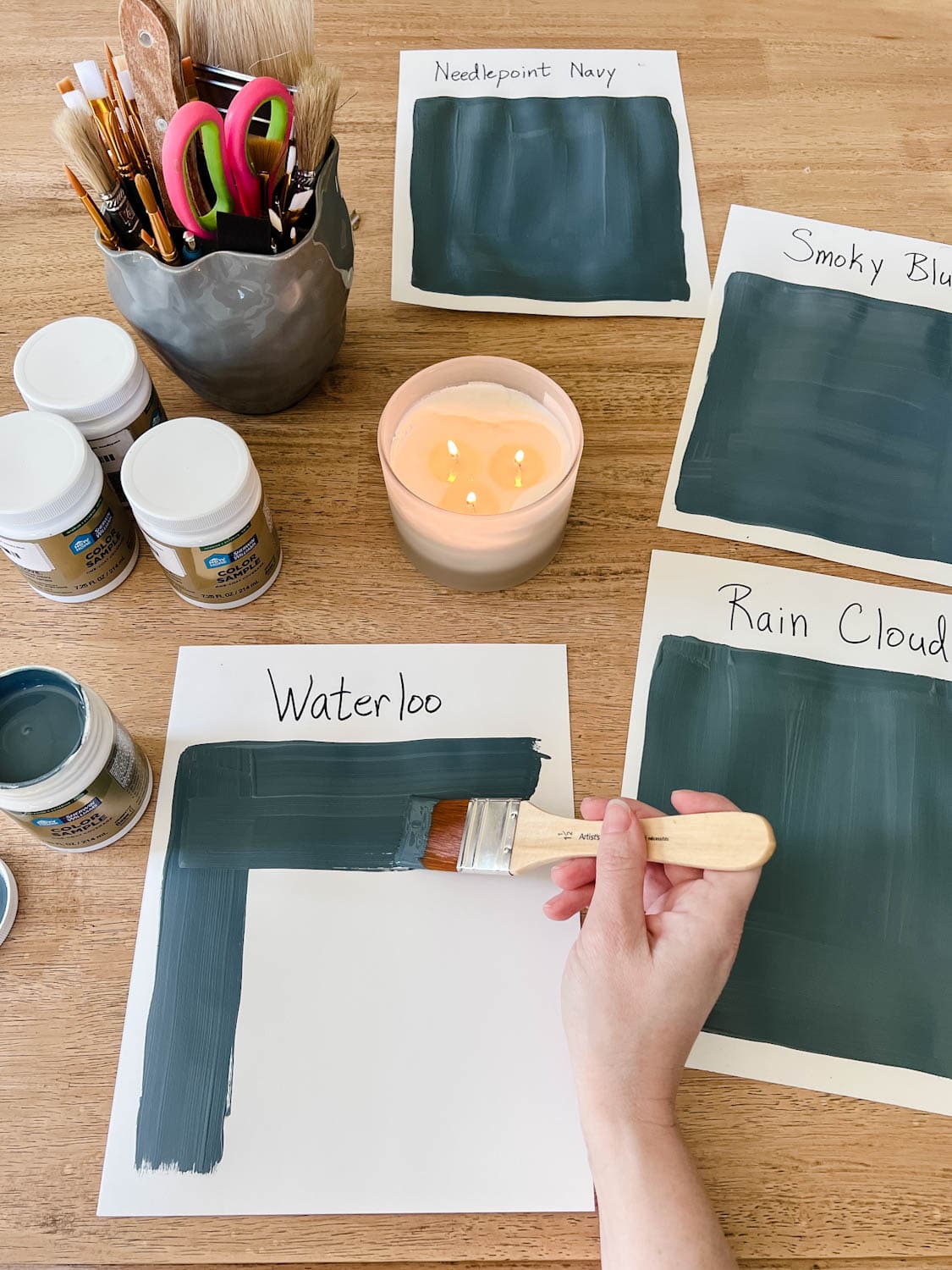
If you ever need help choosing colors for your own home, here’s how to find the perfect paint color every time.
In a nutshell…
Tips for Choosing a Paint Color
- Scour Google and Pinterest for paint color names (but DON’T completely trust how they look on your screen).
- Look at the paint colors in person at the paint store on sample paper strips.
- Buy sample pots of your favorite colors from the bunch. (This step seems like a pain to do but it’s absolutely worth it because even the paint strips aren’t totally accurate.)
- Paint your sample colors on a couple of white foam boards and tape them on different walls in the room. Look at the colors throughout the day (and even night) in different lighting to help you pick a favorite.
- Pick your winner! I almost always choose the lightest or second to lightest color on the paint strip or the darkest or second to darkest, but that’s just because I like lots of contrast. Medium shades don’t really do it for me, but that’s just my personal style.
If you want some ideas of my favorite colors, here are all of the ones we’ve used throughout our home.
Our Calming Whole House Paint Color Scheme
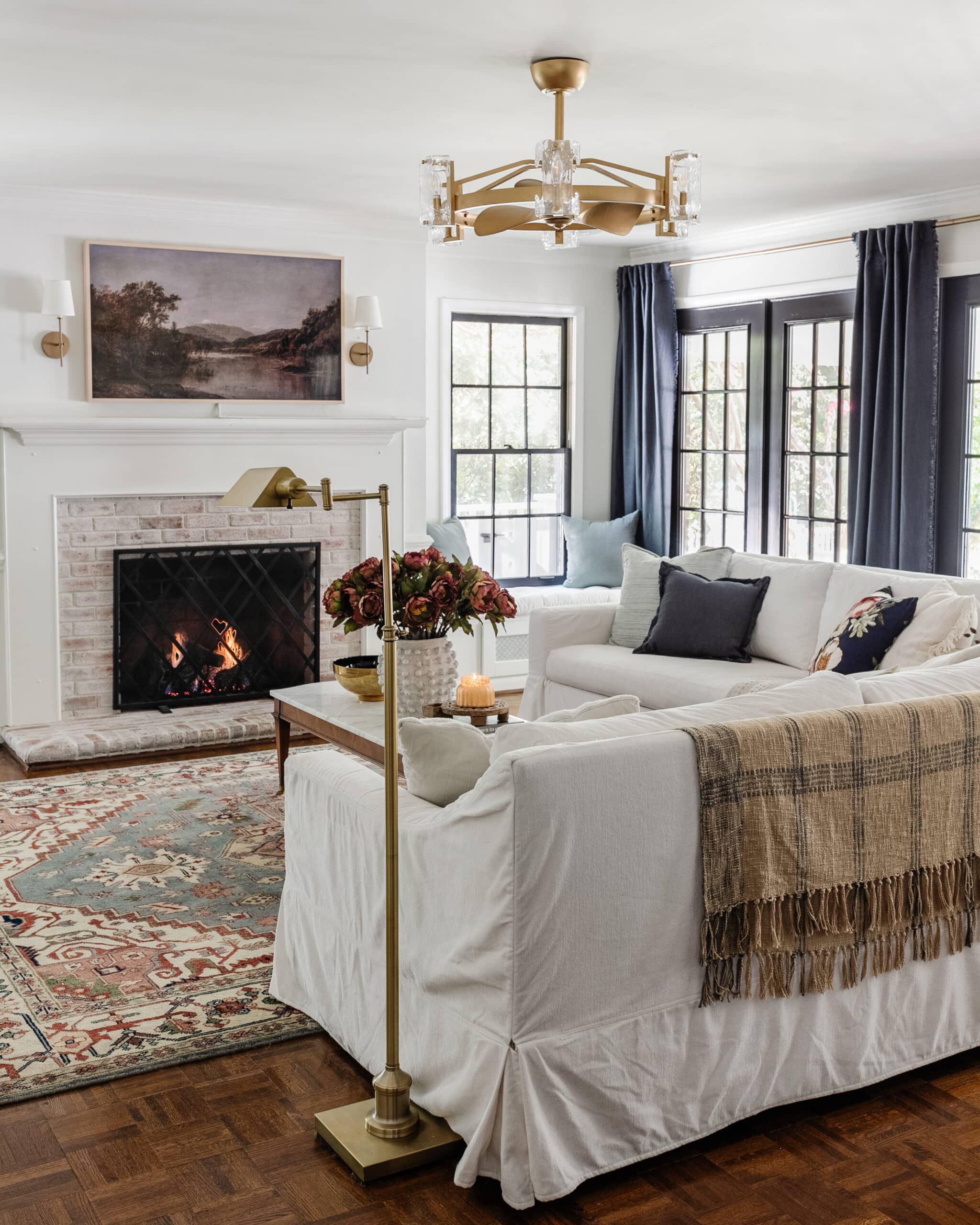
1. Benjamin Moore Swiss Coffee
This shade is a slightly creamy white. It has just enough warmth to help a room feel clean but not stark and “hospital-like”. And it’s great for trim too, but we use Sherwin Williams Simply White for a more true white on trim.
Related: Best Designer-Approved Off White Color Paints to Try
(More info about our living room here)
2. Benjamin Moore Wrought Iron
We’ve painted all of our doors this almost black charcoal shade and love it! It makes every room feel high-end for just the cost of paint (and hides smudgey little kid handprints).
(I have a nifty trick for painting French doors, by the way. And it’s actually strangely satisfying.)
Related: How to Paint Doors and Best Ways to Make Them Durable

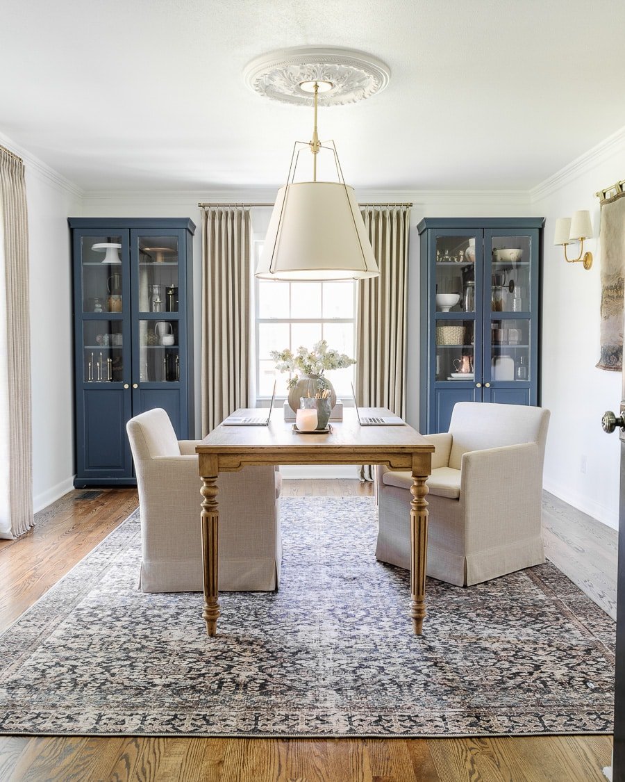
3. Benjamin Moore Chantilly Lace
This is about as true white as you can get. Refined, crisp, and clean. We have it on the walls in our home office, foyer, stairway, hallway, and primary bathroom.


4. Sherwin Williams Willowleaf
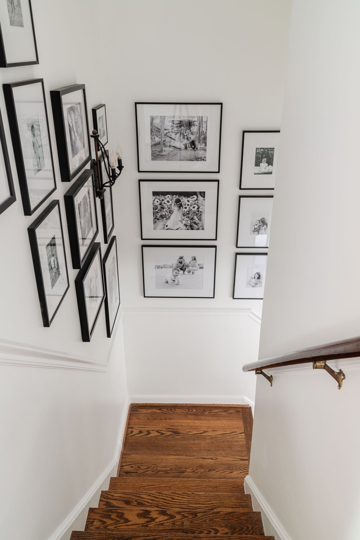
Is it green? Is it gray? Who knows… but it’s definitely beautiful. We didn’t want to go through the effort of renting scaffolding to paint the huge 2-story wall going up our staircase, so painting the trim a contrasting color was a great way to add a little color in our foyer.
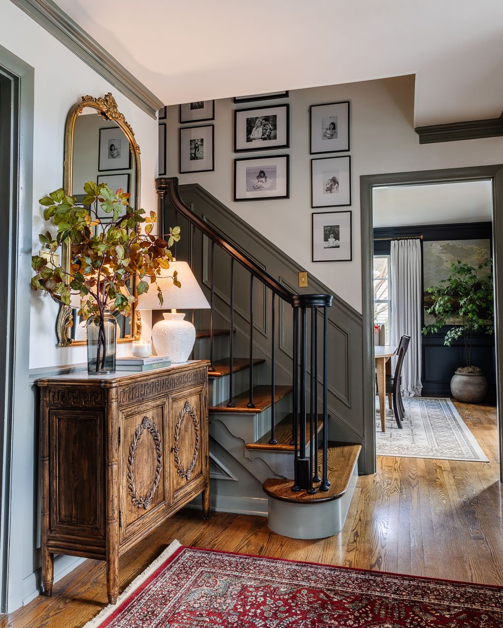
5. Sherwin Williams Slate Tile
We used this color on the bathroom cabinets in the Lowe’s Spring Makeover many years ago, and I fell so in love with this hue that I had to find a place for it in our house. It’s a very deep blue with just enough gray in it to make it a calming, dusty shade.
(More info about our laundry room here.)

6. Romabio Blue Ridge Parkway
I love the richness of this color that is a true classic navy blue. It’s the perfect pop of color that still has the flexibility to act like a neutral.
Related: Best Navy Blue Paint Colors Recommended By Designers
(More info about our dining room here.)

7. Sherwin Williams Billiard Green
More specifically, the lower cabinets are painted Sherwin Williams Billiard Green and the upper cabinets are painted Benjamin Moore Simply White (my go-to trim color).
I probably tested 12 different shades of green before choosing the winning paint color for our kitchen cabinet lowers. The name is very accurate, like the green felt you’d see on a billiard table, a very rich, handsome shade.
Related: Green Kitchen Cabinet Inspiration
(More info about our kitchen here)

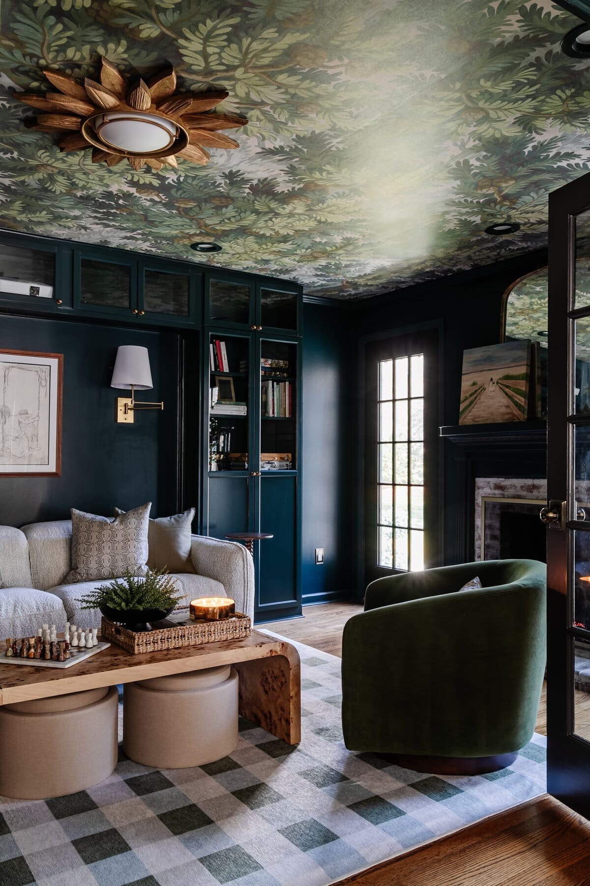
8. Sherwin Williams Cascades
This color is so perfect in our media room for getting cozy and watching our big movie screen on family movie nights.
It’s moody but still vibrant and shifts between the look of hunter green, deep teal, and navy blue, depending on the lighting in the room. It’s definitely a chameleon color that is hard to describe, but it is stunning in every type of light.
Related: Best Teal Paint Colors to Try and Why It’s Trending
(More info about our media room here)
9. Farrow and Ball Brinjal
The lighting in our powder room definitely doesn’t do this color justice. But it’s a gorgeous bold color somewhere in-between burgundy and eggplant. As soon as you walk into the room, it immediately makes you feel warm and cozy.
Related: 12 Trending Burgundy Paint Colors Recommended by Designers
(More info about our powder room here)

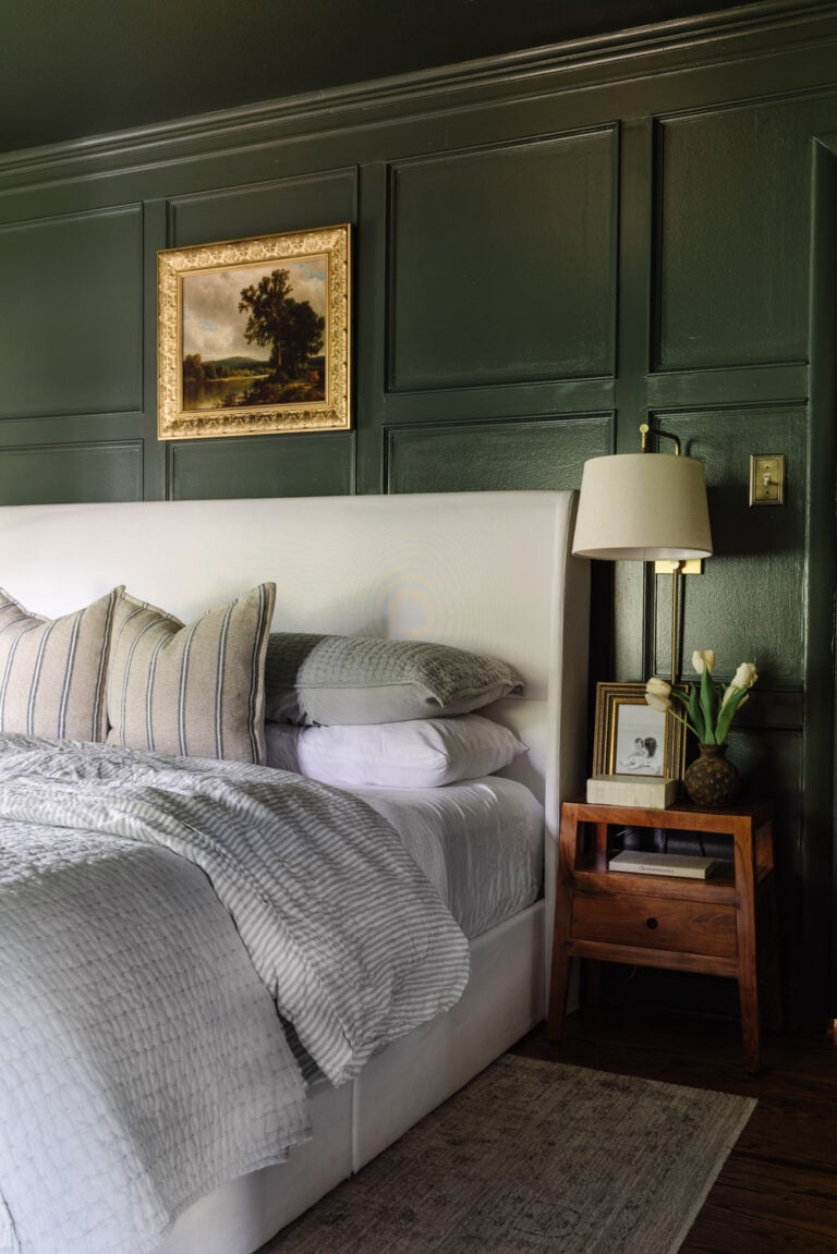
10. Sherwin Williams Smoky Blue
We have an affinity for blue in our home, and I lost track of how many samples I tried to find the perfect bold yet dusty shade of blue. It has a historical vibe to it that immediately transports you to the colonial era.
Related: Most Recommended Blue Grey Paint Colors for a Calm Home
(More info about Olivia’s bedroom here)

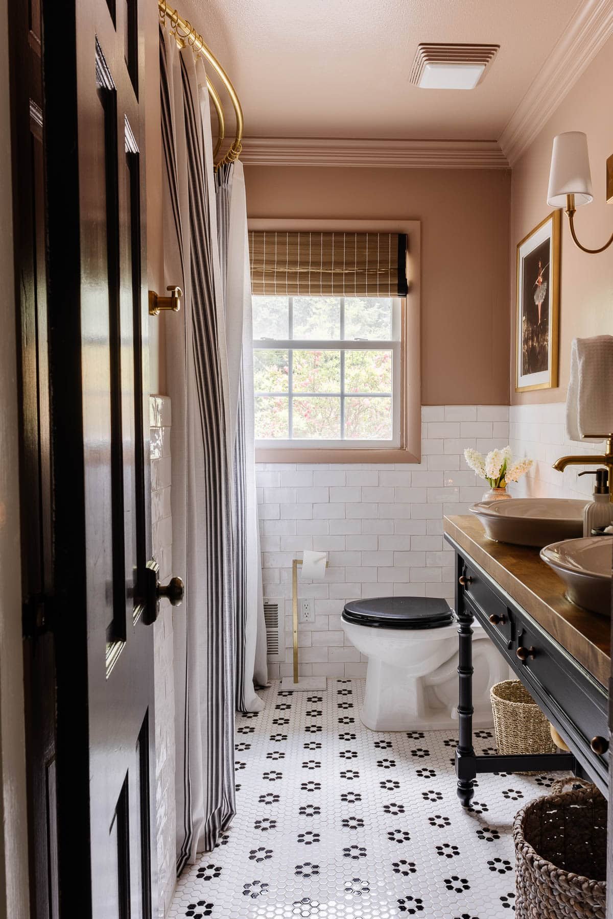
11. Behr Postmodern Mauve
This is my absolute favorite medium blush pink that leans slightly neutral, so it’s perfect for adding warmth to rooms in an unconventional way. We used it in our girls’ bathroom, and it was the perfect pop of color while also making it feel cozy.
(More info about our kid’s/guest bathroom refresh here)
12. Kilz Rebel
This is one of the deepest, truest blacks you can get that creates a very dramatic, sophisticated feeling space.
Related: Making a Case for Black Paint
We gave our bedroom a full makeover in winter 2020 with that heaping dose of drama.

13. Romabio Barefoot Dance
More specifically, the ceiling is painted Romabio Barefoot dance and the walls are painted Magnolia True White.
Just like the name says, Magnolia True White is white that’s bright and true. (Total honesty: I wasn’t in love with the level of coverage, so we never used it again.) But we are absolutely smitten for our Romabio paint on the ceilings in the peachy blushy Barefoot Dance color!
Related: Best Blush Pink Paint Colors Recommended for Interiors
(More info about Regan’s room here.)

14. Benjamin Moore White Dove
If you want the “Goldilocks” between bright white and ivory, Benjamin Moore White Dove hits all the right notes. It has just the slightest kiss of cream.
In our guest bedroom, the walls are Benjamin Moore White Dove and the trim and doors are painted Benjamin Moore Winter Gates for contrast.
We absolutely love Winter Gates for trim and cabinets! It has just enough yellow undertone to make it a warm gray and pairs beautifully with cream and ivory.
(More info about our guest bedroom here.)

15. Benjamin Moore Palladian Blue
I dubbed this one Southern “haint blue” just because it reminds me so much of the porch ceilings you see in Charleston. But it would be beautiful on walls too, if you’re not afraid of aqua.
Related: The Best Haint Blue Paint Color for Porch Ceilings
(More info about our back porch here)

Got any favorite paint colors of your own? We always have plenty of room makeovers ahead of us, so we’ll take all of the suggestions we can get!
Frequently Asked Questions
It’s best to vary your colors while still creating a feeling of continuity. In an open floor plan, it’s totally acceptable to paint all connecting rooms the same color when there is no definitive break between spaces.
That’s all up to your personal preference. Sometimes it can be fun to make the ceiling a statement or the trim a statement all on its own with a pop of color. But if you are using white for both, it’s best to use the same shade of white.
The answer to paint sheens will probably vary depending on who you ask, but I like to use flat on ceilings, eggshell on walls, satin on cabinets, and semi-gloss on trim and doors. I hardly ever use gloss, unless I’m going for an ultra shiny, modern appearance on furniture.




Howdy! I had a couple questions for ya…Do you paint the top edges of your doors? Have you ever have the dark paint from your door edges leave mark’s on your light colored door frames? Thanks! Your home is so inspiring!!
Allison, I would paint the top edges. Consider this especially if you have an open staircase overlooking space in the house. Also, we have not had dark marks transfer. This could differ if your doors fit tight when closed.
Your house is gorgeous! I have a large entryway where you can see the second floor. It then flows into the family room and from there the kitchen. I have it all painted the same color. I’d like to update it. Would Classic Gray work for all these areas?
Hi, Nadene! Thank you!! Sample the color you want to color in each of the rooms and if possible sample in a place you can see from and through to the other rooms. See if you love it.
Your home is really beautiful, the interior is stunning. I love this.
Thank you! 🙂
Beautiful selections. I too love blues, greens, neutrals and creamy whites. I am curious about your darkest colors. I noticed that in addition to the BM Wrought Iron, you have in the past used Behr Cracked Pepper. Maybe it was in your previous house? Could you comment/compare them for me? I have used Charleston Green for my front door, and I do love the color, but it may not work as well on a French door project I hope to do soon. Thanks! Recently found your blog and love your style!
I
Thank you, Jenny! Behr Cracked Pepper is what we used on our exterior doors and shutters because our contractor preferred Behr. But all of the interior is BM Wrought Iron. Both colors are very similar and nearly identical. I hope that helps clarify. 🙂
Would you say Cracked Pepper or Wrought Iron for 1 set of shutters and a front door with a light yellow home?
I’d do Cracked Pepper. It’s a bit darker than Wrought Iron and more striking for exteriors. So it’d look more like this: https://www.pinterest.com/pin/275915914660278042/
Your home is absolutely beautiful! The paint colors are perfect in every room. You have inspired me.